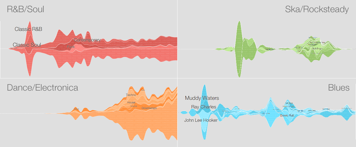
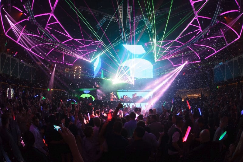
If you’re partial to an interactive map, you’ll love this. Google have charted the history of modern music through Play music; by observing their users’ libraries:
Today, we’re releasing a visualization to show which music has stood the test of time, and how genres and artists have risen and fallen in popularity. The Music Timeline uses aggregated data from Google Play Music to show the changes in music genres over the decades.
You can even click on a map and see what the biggest albums are in that genre or year. Or you can, “search for a particular artist to see the trajectory of their career.”
When you get tired of that, you can start getting a bit more creative. Madonna’s reinventing herself again? Contrast it with the latest Avicii single. Falling in love with The Prodigy’s Fat of the Land? See how it compares with the Ultramagnetic MCs’ Critical Beatdown. The possibilities are endless and you could waste hours just looking at a timeline of the different genres in electronic music!
But more importantly, do you think that’s it accurate? The Dance/Electronic graph does look worryingly smaller compared to Rock and Indie music… Would that be correct?
[Google]


