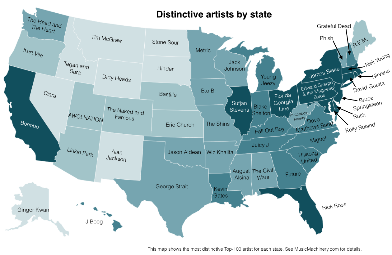
All the way back in last February, we reported on a “music map of the U.S.” However, like any kind of reported data, it runs the risk of being misinterpreted. Such was the case with the initial report, as it “didn’t show each state’s favorite musician to listen to, but instead showed an artist that each state listened to disproportionately more than other states.” It’s a slight error in representation, but a significant enough one to completely change the look of the map. If you look at the one linked to above, the artist names are spread out and vary wildly.
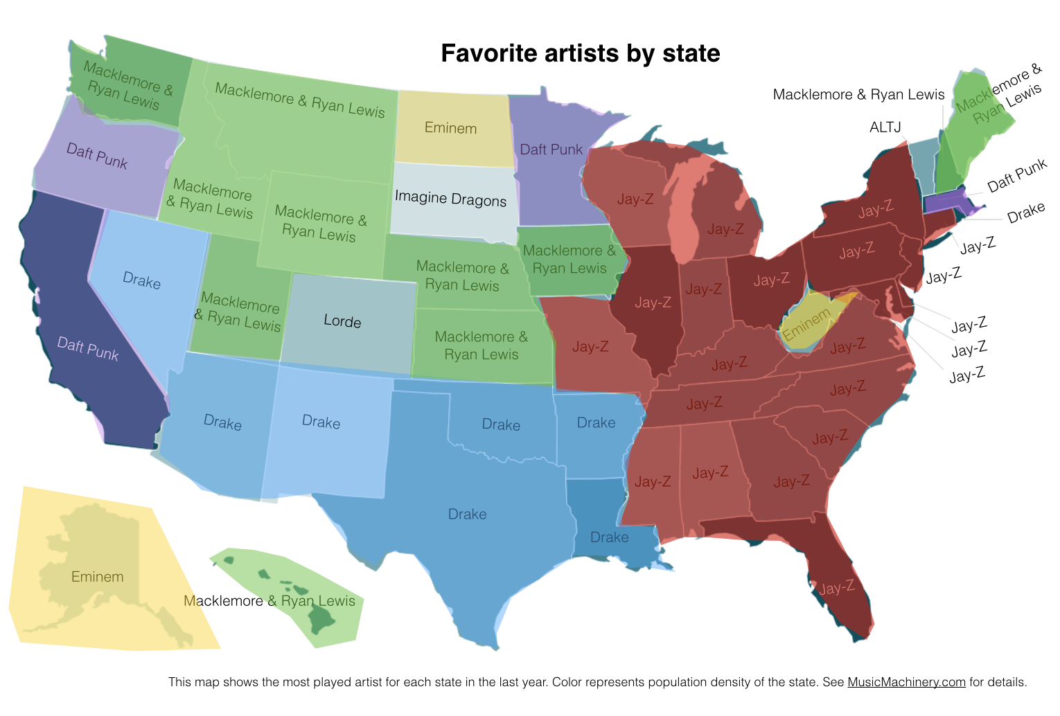
Corrected for that error, the real map looks absurdly different. Specific artists absolutely dominate specific regions of the country – look at Jay Z – while others like Daft Punk find themselves casting a wider net. This new map specifically is a “map of the most-played artist in each state, based on music streaming data available through The Echo Nest.”
Take a look at the comparison of the two maps below.


Source: Vox


