SoundCloud has quite a few faults whether you’re a regular fan, industry professional, or artist; but one of their biggest gripes so far has to be their SoundCloud mobile app. While I can’t speak for Android users, as an iOS user of the SoundCloud app I can definitely attest to the issues of the platform ranging from a lack of stats, the weird iTunes portal bug, or even just the poorly designed UI. Compared with the Spotify app, or even Apple Music, the SoundCloud app’s search design and functionality are frankly lagging miles behind.
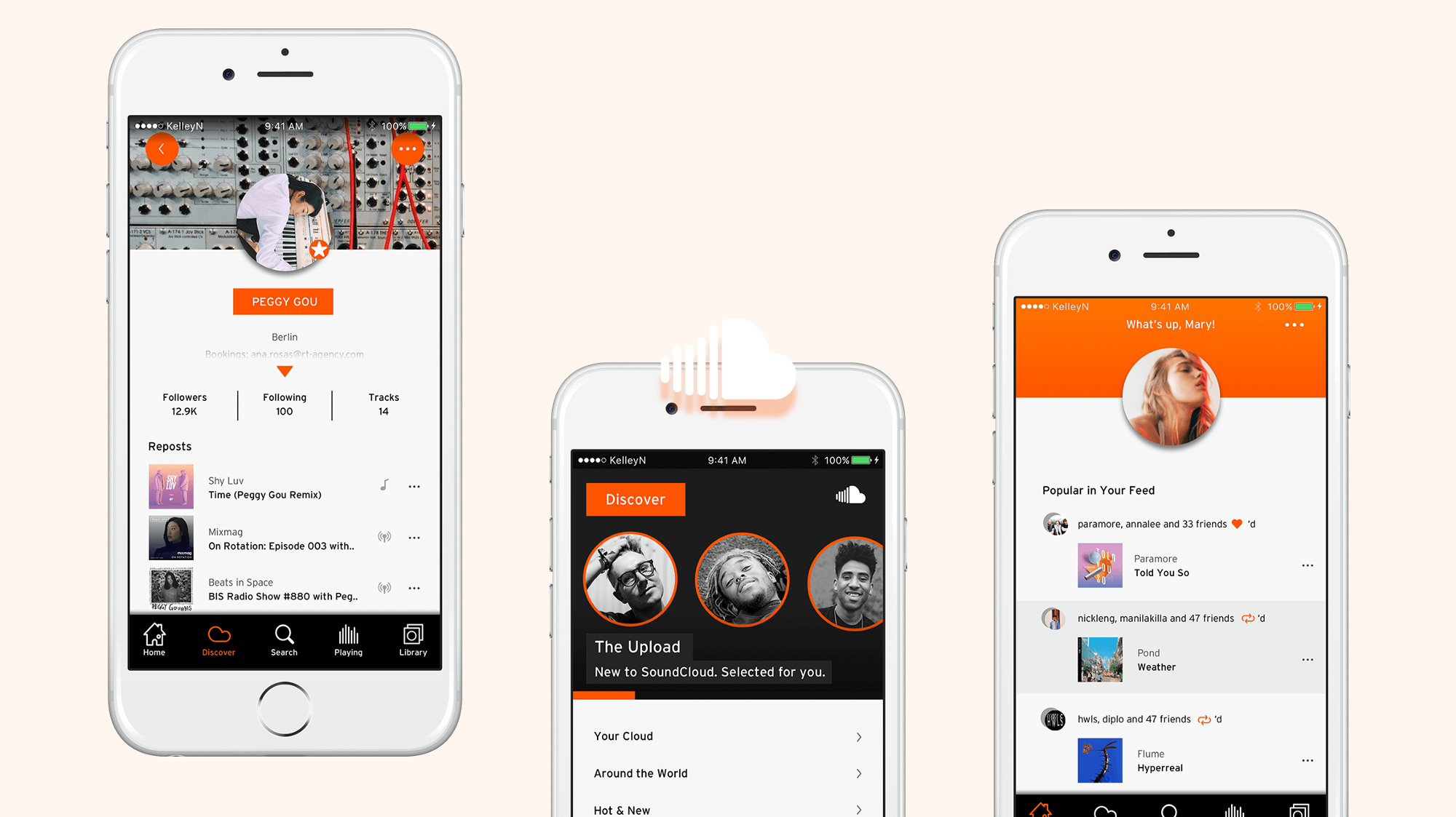
Thankfully, UCLA graduate Kelley Nguyen has taken it upon herself to give us a sleek overhaul of the iOS mobile app’s UI while simultaneously reimagining and redesigning the entire app from scratch. From market research on the size of the global recorded music industry to interviewing people on how the app could be improved to a thorough analysis of the Spotify and Apple Music mobile apps, it’s clear that Kelley did more than ‘redesign the app.’ In essence, she completely rethought SoundCloud’s entire existence within the music industry ecosystem.
Seeing as she went through a very thorough process while explaining her rationale for even attempting something like this we encourage you to read through her post for the full redesign, meanwhile we’ve highlighted some of our favourite changes below.
For starters, she completely redesigned profiles to now include full bios, follower numbers, social links and more. Notice how you can easily slide up or down for more information plus the cleaner function bar at the bottom of the app.
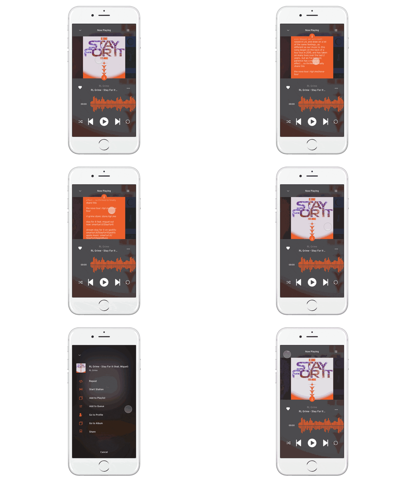
Some more changes include a vastly improved redesign of the SoundCloud waveform when a record is playing, plus more obvious pause, share, like, add to playlist buttons etc.
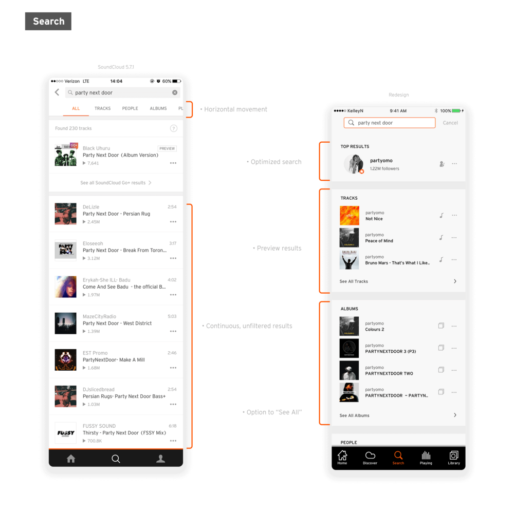
The almighty search function has also been updated to optimize results and divide based on album, artist, song-name etc.
Keep in mind there are just some of the few things that Kelley’s changed so be sure to read her full post for more and hopefully we get to see this rolled out one day!


